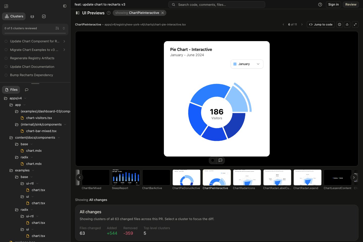
UI previews render changed components next to their code. You can click through them, change props, and resize them.

Opening a preview

Choose a component from UI Previews in the pull request overview, or open its preview from the code. Click through interactions, change props where available, and adjust the width to test smaller screens. Previews support React and Solid components with Tailwind or plain CSS. They take time to generate, and some components may not have a preview.

Comparing revisions

When both revisions are available, use Split for a side-by-side comparison or Slider to move between them. You can change the background to check contrast and transparency. Assert rendering shadcn's interactive pie chart from shadcn/ui, with its month selector and preview toolbar
Commenting on a preview

Enable comment mode in the preview toolbar and click where you want to comment. The comment is attached to the component’s code. Choose Add To Review or Comment Immediately, as with code comments. Turn comment mode off to interact with the component again. Use the share action to send a teammate a link to the preview.

File previews

Use the preview control in a file header to read rendered Markdown, view an SVG or HTML page, or browse JSON as a tree. Switch back to Code to see the source.